Skeuomorphism in Audio Software
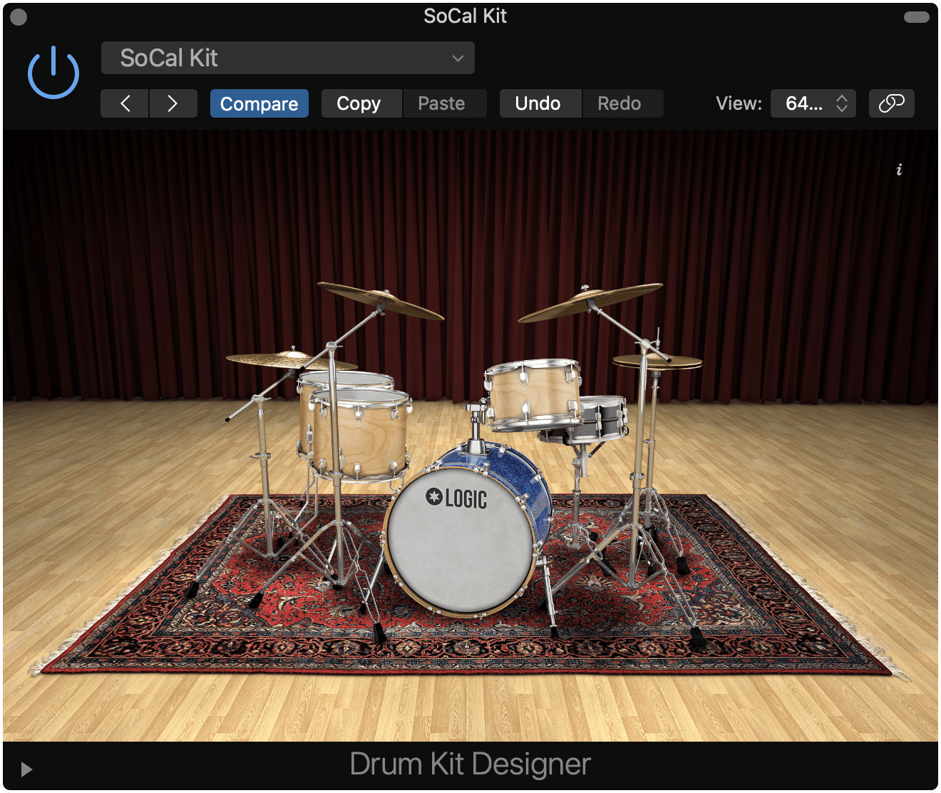
Skeuomorphism in user interfaces fell out of fashion circa iOS 7, but it’s alive and well in audio software. Take a look at the Drum Kit Designer in Logic.
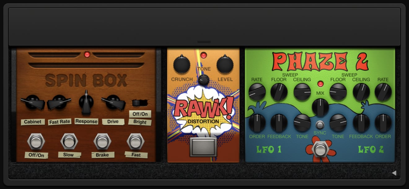
Or the Pedalboard.
I especially like the Vintage B3 Organ. Not only does it have scuffs on its wooden panel, but also an animated… spinning thing (I don’t know enough about organs to tell you what this is).
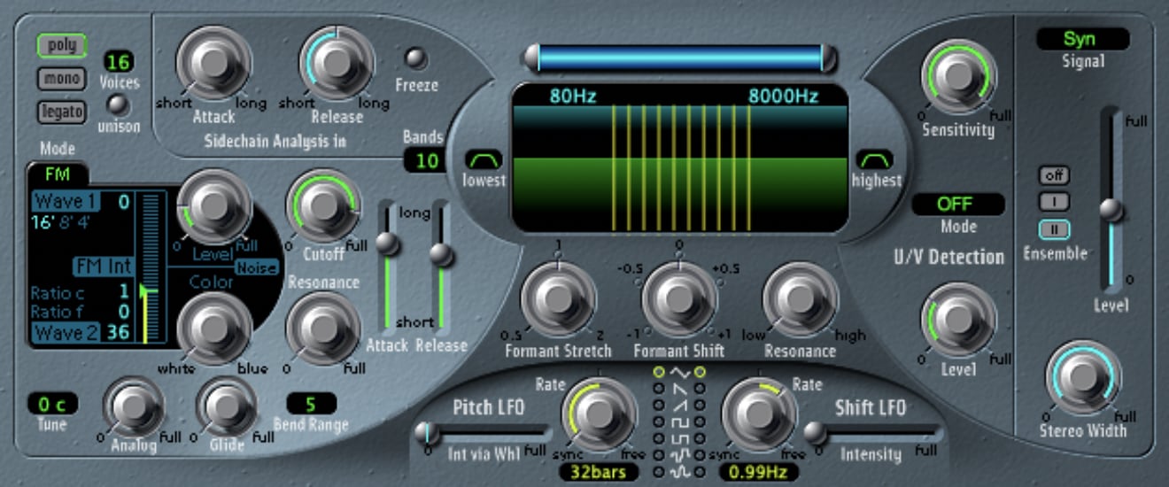
Some instrument UIs are downright wacky. This is the EVOC 20 PS, which looks like a panel in a retrofuturistic spaceship.
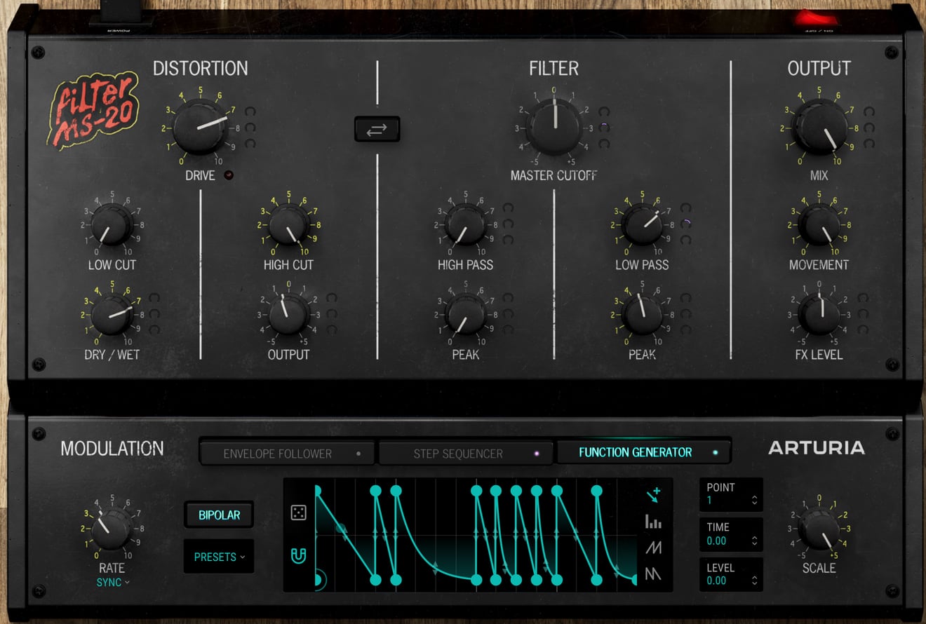
Third party developers embrace skuemorphism too. Behold the Arturia Filter MS-20, modelled after the vintage Korg synthesizer of the same name. The glowing backlit buttons, the peeling sticker, the grime; so good.
Unfortunately not all instruments look like their real-world (or imagined real-world) counterpart. Take Logic’s Alchemy synthesizer. Not a scuff or scratch in sight.
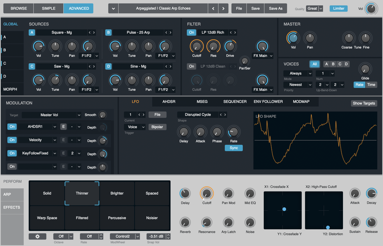
I understand the drawbacks of skuemorphism — it wastes space, analog controls like radial dials translate poorly to mouse-driven UIs, and so forth — but I love the whimsy of these designs. These instruments look fun.
All of which is to say, Tim Cook if you’re reading, please bring back the leather stitching and ripped paper in Calendar.app.