Methodic Branding Refresh
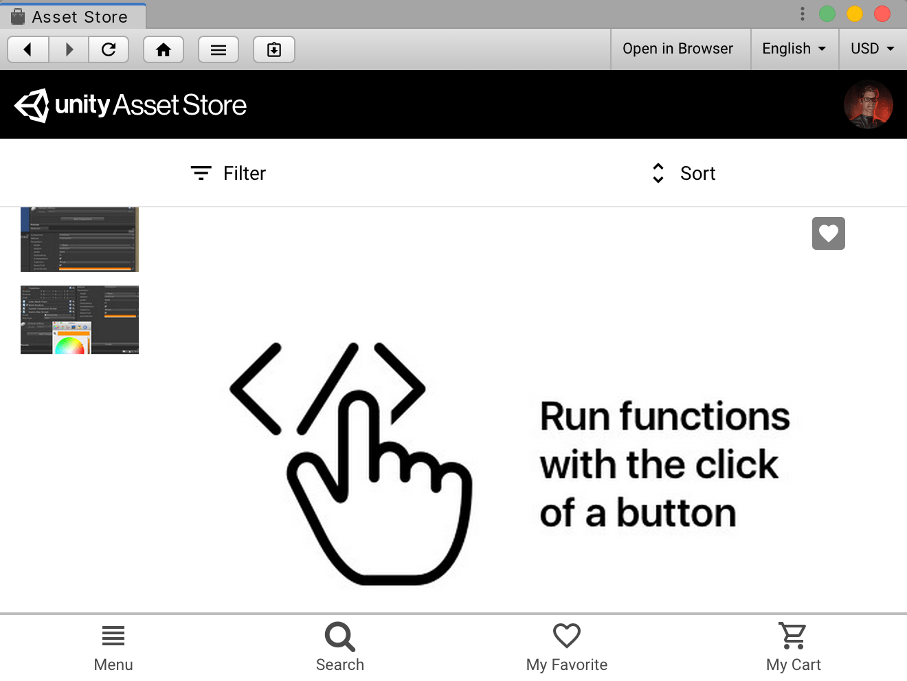
The Unity Asset Store updated their image size requirements, so I took the opportunity to give the branding for Methodic a fresh coat of paint. Here’s the old hero graphic:

I was going for minimalism, but let’s be real, it’s dreary stuff. For a refresh I wanted an isometric style, if for no other reason than I had just visited Cmd’s website and dug the look (it’s a sexy home page, very “competent cyberpunk”).1
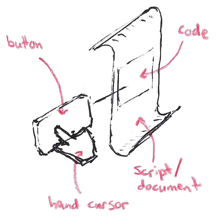
I outsourced the graphic design to Fiverr. This was my first time using a freelancer marketplace (believe it or not, that old Methodic branding was made in-house). I roughed out this quick sketch for the designer to work from:

I’m trying to communicate that Methodic allows you to run your game code via a GUI. I don’t think it totally succeeds, but in any case the designer mdaproject did a fantastic job turning my clumsy napkin doodle into a polished graphic.2

The turnaround was quick and the designer was responsive when I requested tweaks. Painless experience overall. Will use Fiverr again.